Last Updated on December 6, 2024
We’ve finally finished the modern kitchen makeover on a budget, and today is the big day to share the final reveal of this beautiful renovation! Are you as excited as I am, or did you spy the feature on House Beautiful?
It feels like forever ago, since I shared the kitchen renovation mood board. If this is your first time here, the luxury stone is by Cambria quartz. You can read more about why it was chosen for not only the countertops and island, but also for the backsplash here, and you can check out demo day of the old kitchen design here. Without further adieu, let’s jump into this dramatic kitchen renovation reveal!
Table of Contents
A Kitchen Renovation On A Budget? Yes, It Can Be Done!
The kitchen design in our home turned out to be a quick flip reno done by the previous homeowners. And although it was functional, it was dated and lacked style. The busy backsplash tile was not my favorite, and the existing granite countertops were pitted and part of their pre-flip. Not to mention that the former homeowner’s contractor just slapped some black paint on the old island cabinetry and called it a day.
I knew I could create a modern kitchen makeover on a budget with some savvy home renovation decisions and a keen eye for design. Ya, you read that right, this modern kitchen makeover was not a $100k home improvement project. In fact, it was a fraction of that.
All Photos by Stoffer Photography Interiors
A few years ago, I visited Cambria for their Design Innovation week in Minneapolis. At the time a kitchen renovation and home improvement, in general, were not top of mind. We had just unexpectedly refinished the basement since the great basement flood in addition to Potty Paradise and were completely over construction dust. But after returning home, I was dreaming of slabs upon slabs of quartz – the home improvement itch had to be scratched.
Last January, I told The Boy it was time. His first question was, “And where are we getting all the money for this fantasy kitchen renovation idea of yours?” Ahhhh, good question sir! Let me dazzle you with my words.
We’re not going to do a traditional kitchen renovation, we’re doing a skinny makeover (thank you for that phrase Erica Reitman). The perimeter cabinetry will remain intact and stay as-is. Would I love to have navy, mushroom, or dark green cabinetry? Of course! I love shiny new things! Was it necessary to swap them out? Nope. By saving the original cabinetry and working with what we had, we saved SOOOOOOO much money.
The original flooring stayed as well. Did I love it? Nope. But there was nothing wrong with it, and later down the road, we could install something new. Baby steps, my friend. The fridge and dishwasher had been replaced shortly after we moved in because the lovely former owners did not disclose that the dishwasher leaked when we bought the house. The fridge bit the dust shortly after we moved in. The struggle is real when you buy a new house. Don’t even get me started. I mean, would I love a new True Residential refrigerator? Heck yeah! That beauty is a showstopper, but when conquering a modern kitchen makeover on a budget to woo one’s husband, one has limited resources. The fridge might be another baby step down the road.

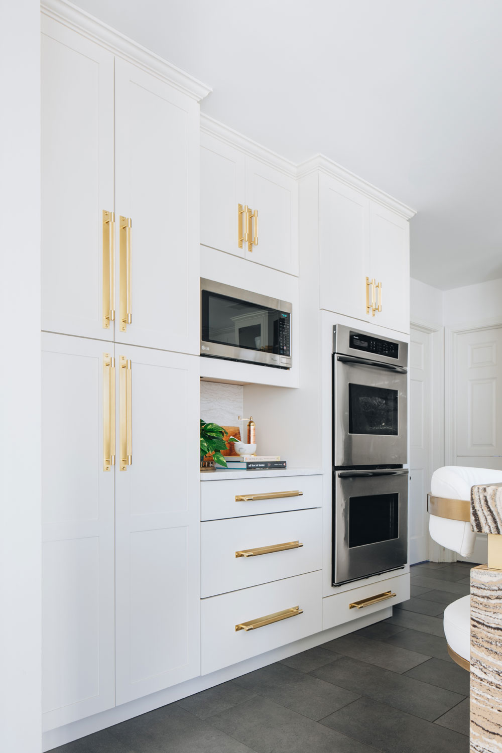
The double ovens will need to be replaced at some point, but for the most part, they work. The door doesn’t completely close on the bottom oven causing it not to keep its heat. It’s really only an issue on Thanksgiving Day. The top oven’s fan is as loud as a chainsaw, but I can whip up a casserole with no problem. Besides, the double ovens I was eyeballing started at $7,000, and that was outside of the scope of the budget.
The biggest money-saver — and this was the deciding factor — we didn’t touch the floor layout. No moving gas lines or water pipes. Everything stayed the same. We channeled a surface makeover! What exactly did we spend money on? Lemme break it down.
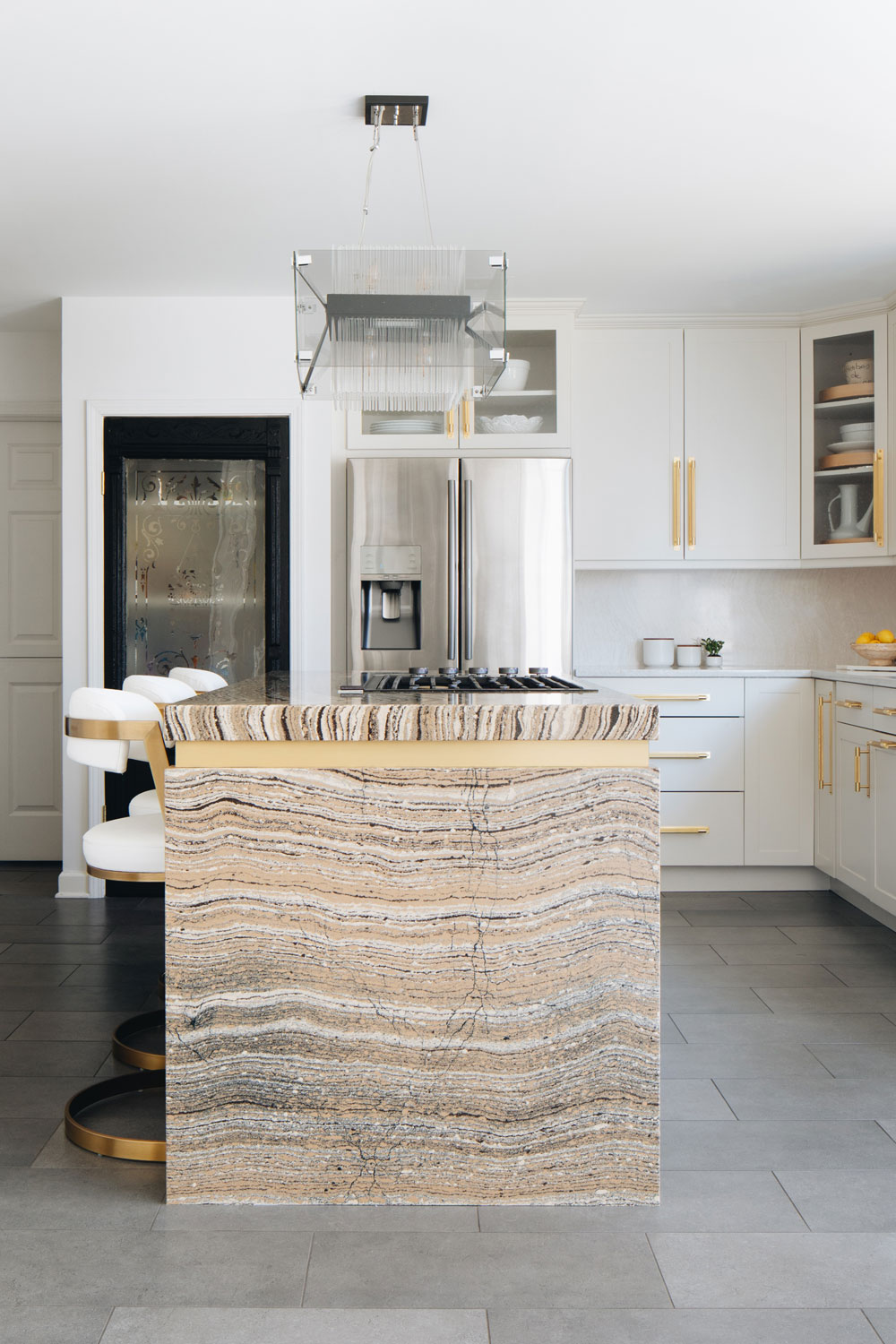
Replacing the old black pitted granite with beautiful quartz by Cambria was where we invested our money. It was necessary and would completely transform the entire space. To really make the investment pop, I worked closely with my stone fabricator in Barrington, IL to add extra details. The bold pattern on the waterfall island with the brass inlay and the floating shelf over the wet bar…those are the hummena, hummena, hummena design details that really set this modern kitchen makeover apart from the rest.
New countertops meant investing in a new sink, faucet, and cooktop. Once you cut the stone, there’s no going back. The quartz is locked into its place. Since the existing sink was outdated, an upgrade was necessary. I found this black quartz sink by Elkay and fell in love with this cooktop with brass burners…although the brass burners are only for show. If you use the brass burners, the high heat turns them gray…don’t ask me how I know. Palm to forehead. FYI, they shine up with Bar Keeper’s Friend and a lot of elbow grease.
A couple of weeks prior to visiting Cambria, I was lucky enough to tour Delta Faucet’s headquarters. My black matte faucet is by Brizo (owned by Delta) and is in the Litze Collection. This particular faucet is offered in multiple finishes. Personally, I love the knurled brass handle and matte black finish. I’m also obsessed with the SmartTouch technology…and yes, now I go around tapping all faucets expecting them to fill my glass miraculously. You’ll see below that I also used the Brizo bar faucet and Elkay bar sink for the wet bar.
I could have played it safe with a white marble-like pattern throughout the kitchen…it would have looked absolutely beautiful. But with this kitchen renovation, I wanted to push myself outside my comfort zone…much like I did with Potty Paradise. Also, I tried to tone down the harshness of the white and black combo by adding a beautiful color scheme of creams and browns. It warmed up the space. Clairidge was not a pattern I thought I’d lean towards…like ever! It was bold and smacked you in the face…it was loud.
But after a small push from the Cambria team, I decided to play around with it for the island. After using Cambria’s augmented reality app and some Photoshop magic, I thought to myself, “hot damn, that quartz could make a bonkers good focal point”. To make it pop, I added Ironsbridge for the perimeter countertops. The subtle movement was soft enough to still emphasize the island. Sweet, but what about the backsplash?
I tried tile after tile sample, but everything I chose fought with the kitchen island. I changed gears and tried using the same Ironsbridge design for the backsplash, but everything seemed to fade away, making the island the showpiece. Shazam.
The old island cabinetry was replaced with a simple black cabinet, but to make it dazzle, I added brass pulls from Buster & Punch. So sparkly. They shined on the white kitchen cabinets, but holy luxe when installed on the black doors combined with the Clairidge quartz. BTDubs, this hardware almost didn’t happen.
The original pulls were your basic brushed nickel from the local hardware store…nothing wrong with them, but also nothing super special. The Boy pushed back since the cost of pulls adds up…especially when you need 50 pulls. We decided to wait on ordering anything until the quartz was installed, but in the end, Buster + Punch took this modern kitchen makeover to another level.
Another splurge was replacing the old bar stools. Did we need to replace them? Nope. Did I want to? Yep. What I had were wooden Mid-Century Modern wishbone chairs. What I wanted were brass cantilever bar stools which I found at Scout Design Studio. Their website describes them as a little sass and a lot of class. I couldn’t agree more. The performance leather definitely helps with little kids, pizza, and chocolate hands. Everything just wipes right off. Even the yellow curry I spilled all over them.
The last bit of jewelry that kicked the design up a notch and transformed the space was lighting. Basic globe pendants would be beautiful and safe, but I wanted luxe and sparkle. While perusing High Point Market, I waltzed myself into the Hudson Valley Lighting showroom and fell head over heels in love with this art deco-inspired chandelier. How perfect of an eclectic mix would that beauty be over the tulip table?
The artwork is by local artist and vintage dealer Kelly Caldwell…you can find more of his art on Instagram at @zovietfrance02, (he also has a few pieces at High Point Market). The black-on-black squares artwork was the perfect statement maker for this kitchen renovation. I love how it plays with the woven leather back Arthur Umaoff chairs from The Savoy Flea.
I found this glass rod chandelier while poking around on the Hudson Valley Lighting site. It’s bananas and from their Troy Lighting line. The warm bulbs soften the shiny chrome, and the smoked glass is pure perfection. Plus it has kind of an 80’s glam vibe to it. I went back and forth between this light over the tulip table or the other…in the end, the crystal rod chandelier won the island. Yes, I know it’s gonna be a mess to clean grease and gunk off of it, but ya, I don’t care. It looks spectacular.
The Wet Bar Remodel
One major eyesore was the wet bar on the opposite side of the black square artwork wall. The bar resided in the living room, and the design was straight out of the 1986 basic builder model: textured laminate countertops and french country cabinetry. The whole look needed to go.
When we first moved in, the initial thought was to remove it entirely, but after hosting a couple of parties, we saw the value of a wet bar. Guests mingled outside the kitchen and helped themselves to cocktails. With the kitchen being renovated and the wet bar on the opposite side of the wall, it naturally became part of the kitchen remodel.
RELATED: Sharing a behind the scenes look at how we built the floating stone shelf. Take a peek!
The same black cabinetry used for the island replaced the painted outdated french country, but I chose a third quartz design…yes a third. Now, normally I would not advise this insanity. It’s kinda like using seven different fonts in graphic design. But Ironsbridge was so subtle and there was one design that my heart yearned for…Brittanicca Warm. I saw the very first test slab come off the line while visiting Cambria. We were not allowed to photograph it, but you can make bet that I drooled all over it. Time to break the rules.
Cambria’s Brittanicca Warm would become an accent wall of stone with a floating shelf in the center. To see how the heck we managed that, you can read about the fabrication and install process here. The three designs worked so well together…thank goodness, because that could have been a very expensive booboo to fix.
The same Buster + Punch pulls were purchased for the wet bar, but instead of brass, I chose matte black. Now, if I could do it all over again would I keep the black or change to brass? I’m not quite sure of that answer. Part of me says yes…part of me says no. The brass pulls on the island are so shazam, and this is a quieter look and feel. The floating shelf remains the star of the show.
The final detail was the vintage door. I searched high and low and finally found this one. When I showed Brian, my local contractor, he took a deep breath. “We can do it, but it’s gonna cost more. The entire door would need to be reframed because it’s not a standard size.” Do it guys! This was the final stretch, and for the most part, the kitchen renovation had stayed on budget, thanks to my free renovation checklist. To go a few hundred over…I’ll do that all day son, and boy oh boy, was it worth it. It’s backlit and looks fanfreakintastic! Oh, and yes, that is the original etched glass.
SPECIAL SHOUTOUTS TO MY TEAM FOR MAKING THIS HAPPEN!
Brian, Mitch, and Cesar at MidConCo in North Barrington, IL
Nanette at MGT Stone in Barrington, IL
Without you, I would have failed greatly. Thank you for helping me through the kitchen renovation and home improvement process. Together we created the best modern kitchen makeover on a budget! And in case you were wondering, no, white kitchens are not out of style.
Discover More Eclectic Home Decor Ideas
Here are seven genius ways to hang a picture, including hanging art with two hooks, hanging a gallery wall with no tools, and hanging a picture without damaging wallpaper.
If you want to spruce your backyard, check out this round-up of the best outdoor patio furniture.
Ever second guess yourself on what rug size to buy for a living room? Here lie the answers you desire.
Learn how to marble dip mugs with nail polish in this easy DIY. They’re perfect for holding a gift card or pencils.
Looking to spruce up your backyard for summer? Check out these comfortable outdoor patio furniture top picks.
Ever second guess yourself on what rug size to buy for a living room? Check out that post to nail it the first time and then jump over to get the five layout options and learn how to arrange a living room with a fireplace like a pro.