Last Updated on December 6, 2024
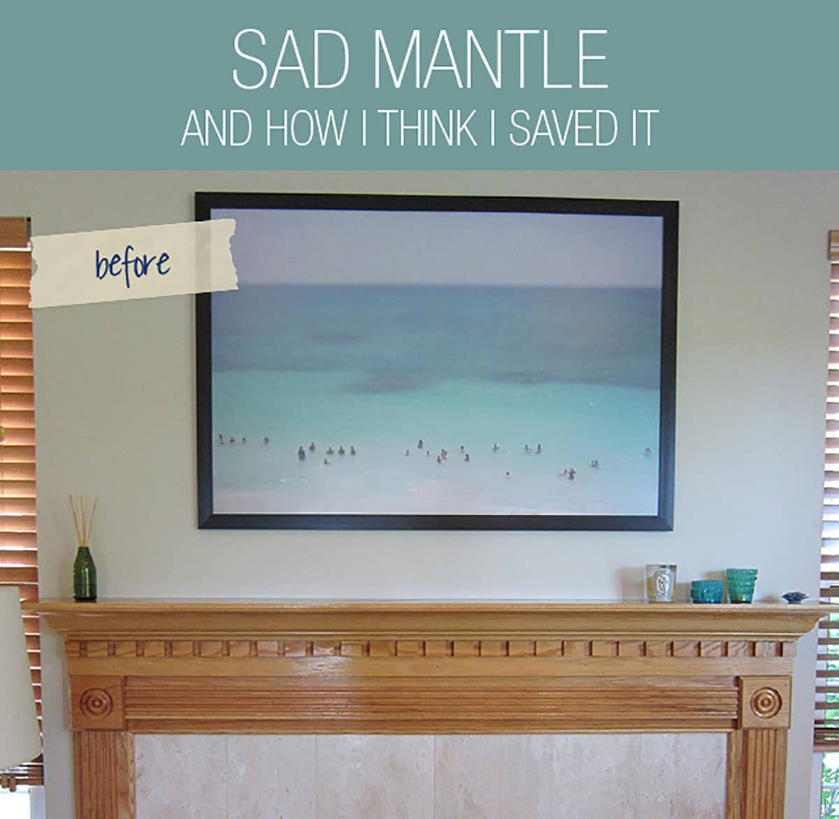
The present state of the mantel styling makes Emily Henderson cry…seriously, it does. It needed a makeover…badly. One of the best features in a home might just be the fireplace, and mine was embarrassing. To say the least, it was not the fireplace of my dreams. In fact, a large part of me wanted to take a sledgehammer to it. But rather than take things to such extremes (mainly because we have been living in construction zone central for almost 3 years), I chose to dip my toes in the mantel makeover. To keep it quick, clean, and easy, I decided to keep the ugly molding and even uglier marble and gave it a simple facelift. (The Boy and I discussed painting it white, but since all of our trim was medium wood, we thought it might look weird.)
This is a pretty old post that you’ve found! Click over to see our updated custom fireplace design in the new house.

RELATED: Don’t miss the before and after brick fireplace makeover that recently went viral. Some hated it and others loved it. You be the judge.
I’ve tried to place things I love over it to mask its ugliness. One of my favorite pieces is the max wanger “tulum” photo. I purchased it two years ago before it made a giant splash in the interior design scene. I thought I had nailed it until I saw my girl crush, Emily Henderson, frame it in white about 6 months later. My heart sunk…IT LOOKS SOOOOO MUCH BETTER! I also loved the turquoise tea lights from Jayson Home and Garden. They tie in the ocean colors just perfectly! They were to stay.
It’s been looking like this for a couple of years now, but it wasn’t until I posted my to-do list that things came to a head. Something HAD to be done with this mantel…so I watched this…over and over and over again.
Option number one of finding a commanding piece…I had knocked it out of the park with that Tulum photo. It was substantial without being overpowering and it took up just the right amount of space. Booyah!
The objects, vases, books, and collections piece were where I had been tripping myself up. see, my mantel was not deep. In fact, it was less than 6″ deep…sad face. so I went on a hunt and scoured Etsy, flea markets, and everything I had existing in my home. I wanted stylish eclectic pieces that gave the entire mantel movement, added height, and texture, softened edges, and added layers. Do all that and stay in the 6″ depth restraint? Challenge accepted.
RELATED: Wanna know how to arrange living room furniture with a fireplace and TV. Get the inspiration here with these 5 layout options.

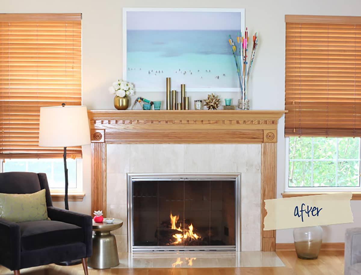
Well, what do you think? I mean, it is still a work in progress. I need curtains to soften the edges and add warmth…and I think a faux fiddle leaf fig tree might get popped into that far-right corner to add in some greenery, but for now, I think it’s getting there! I no longer want to take a sledgehammer to it…in fact, I think I kinda like it! Let’s come in for a closer look.
RELATED: If you’re stumped when shopping for the best size rug for a living room, click on that link.
Mantel Styling With New Home Decor

So what did I do? First and foremost, I felt horrible for making my girl Emily cry for days on end…I immediately spray-painted that frame white. At first, the boy was against this…mainly because I was soon to paint his precious lush lawn white, but he eventually saw the light. I think to quote his exact words, “it doesn’t look so college anymore,” and I will have to agree with him. It looked cheap in the black frame and was too harsh. the white softened everything. I started with Kilz to really cover the black and then went over everything with white enamel. word to the wise, always cover Kilz or dust, and yuck will stick to it. The process of taping, setup, and spraying was about 1 hour, and I had about 3 hours of dry time. We hung it, and the clouds parted, the angels started to sing, the birds chirped…things were starting to look up!
RELATED: Get design ideas on how to style a mantel for the holidays.
I like brass, obvs. the sheen reflects a lot of light, it looks rich, and its patina on older pieces is just plain beautiful. That amazing gold vase is by Nate Berkus for Target circa last year, and I got it on clearance for like $3. It’s been making its rounds around the house, but I think it’s finally found its home. the peonies are silk (mainly because I’m not good about having fresh flowers in the house) from Terrain. They add great texture. at the moment, Terrain is out of its silks, but they usually replenish in September.

The various heights on the brass tea lights give height and interrupt the frame adding the layer effect I wanted. They are also skinny little guys which also helped me add some layers and depth.
This Diptique Tuberose Candle has seen better days, but I refuse to toss it until I burn every last bit of it. it smells soooooo good!
The sea urchin is from Dwell Studios…I’m not entirely sold on its placement. Don’t get me wrong, I love the piece, it just may not be right here, so it may get moved.

So it’s not perfect, BUUUUTTTTTT, it looks much more beautiful than it did! The intention was to be cozy and inviting, young and modern, and not cluttered. So far, I love how it turned out. I need to add a few more things, but I also need to save a few more bucks to attain such pretty little things. I think I also need to find some brass polish to rid that box of its fingerprints…in due time, in due time.
RELATED: Check out these modern vases to style up your mantel or bookshelf.
But before I go, I want to leave you guys with one last photo so you can see how far we’ve come. This is what the space looked like before we bought it…I think we’ve come a loooooong way and that gives me a great feeling of accomplishment. What do you think?


Discover More Eclectic Modern Home Decor Ideas
I’ve rounded up TV art for the Samsung Frame TV that you can download.
Check out the before and after black and white bathroom makeover in the basement.
My honest review of the Samsung Frame TV. Is it worth the hype?
If you’re looking for cheap outdoor furniture, boy do I have the round-up for you! Are are my hands-down favorites!
If you love the Anthropologie mirror that is trending but not the price tag, you’ll want to check out this round-up of dupes to get the look for less.
These Amazon must haves are items I own, love, and can’t live without. Tried and tested by yours truly.
