Last Updated on December 6, 2024
Last week I was invited to a design summit in Minneapolis sponsored by Cambria. (For which this post is not sponsored, but I really wanted to share because I returned fired up.) I walked in thinking inspiration for the kitchen and walked out thinking let’s makeover the entire house. We toured the Cambria Processing Facility and got to see the secret sauce of creating quartz countertops…BTDubs, there is one countertop they are in the process of designing, and boy oh boy did they nail it. I wish I could show you, but alas, no photos were allowed. Our group was the first in the world to even lay eyes on it. And let me tell you, I about knocked over Ashley to pet it.
After touring the facility and learning how quartz countertops were made (side note, you might think it’s a chunk of stone like marble or granite, right? Nope, small bits of ground quartz are pressed together and baked in an oven. I had no idea…anyhoo), we were taken to real-life spaces where different slab designs were used. We toured Wit & Delight’s studio 125 (which is amazing). And Matt Muenster invited us into his incredibly beautiful Mid-Century Modern home. A few restaurants use the countertops in interesting ways. But I think the most stand-out visit of the summit was our workshop at LAB. A creative workshop space where we did just that…got creative.
On a long white table was a sample of Cambria with our name by it, and we were asked to create a mood board. There were 4 tables full of goodies…everything from soap dishes to trivets to tile to wallpaper to books to florals to candles. All sorts of pretties were up for grabs.

I was given Roxwell, which as a background I probably would not have chosen. It would be beautiful as a kitchen island because it’s shazam in your face with a lot of movement. But it goes back to my pillow problems…patterns tend to confuse me. In my head, I prayed someone would want to make a trade but no dice.
Not gonna lie, I was a bit freaked out by this whole workshop. I mean, 2 people down from me sat Orlando Soria, and across from me, Dabney Frake of Apartment Therapy. No pressure, right? Just surrounded by total professionals, and then there’s me, the crazy blogger who just wings it.
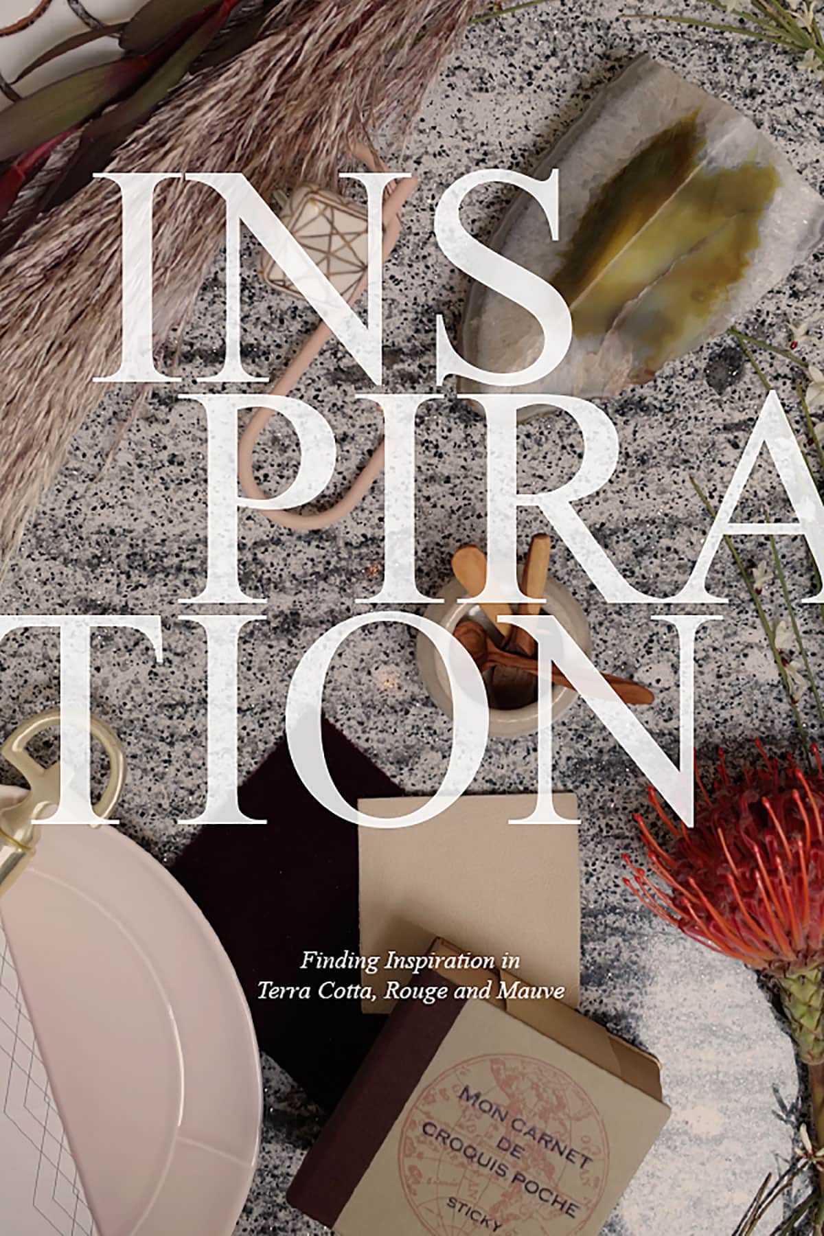
Completely feeling out of my element, my mind started to race. There was no consulting Pinterest or magazines for inspo and copying from my neighbor would probably be frowned upon. All I could think was wow, this is going to be an #epicfail in front of home decor royalty. Palm to forehead, so not awesome. Okay, deep breath, stop panicking, this is what this workshop is supposed to be about. What are you going to do, run away? Embrace it. Explore. I stared at the flowers in front of me, and one kept catching my eye.
Because I was out of my element for a foundation, I took a giant leap of faith and decided to embrace that flower with its shades of terra cotta, rouge, and dare I say it…MAUVE! Now, if you look around my home, you’ll see zip, zero, zilch red…and certainly no mauve. Stupid sculptural flower. Why must you look so cool? But the color was so rich and vibrant. Kyla! Who are you!!!???
Playing with texture, I added in a creamy leather fringe keychain, pampas grass (thank you Instagram fam for identifying), and creamy scalloped tile. The green agate bookend brought in a natural element, plus that earthy green was heavenly. The pale mauve / blush played nicely with the rouge and burgundy. A small beige cup held tiny wooden spoons. Holy crap, I was embracing a very warm color palette.
Every so often, I would stand back and take a photo. After a quick study, I’d remove pieces I wasn’t in love with and replace them with something new. I liked it..in fact, I kinda loved it. Time was up. As a whole, it had a very feminine, cozy feel. All it needed was a blanket and a cup of coffee. How interesting.
Next, our mood boards were uploaded to a computer screen, and we were asked to chat about what inspired us. My mind screamed, “Please don’t be first. Please don’t be first. Please don’t be first. Please don’t be first.” I mean, I was in the company of a few bloggers I knew virtually (Ashley, Erin, Anissa, and Reichel), but I still didn’t want to be first. Thankfully, the decor gods took pity on me.
It was really interesting to see how everyone’s design mood boards were the same yet so different. Most of us embraced those terra cottas and rusty, rouge reds, even copper. One girl grabbed a magnolia leaf and flipped it to the rusty brown side. It looked magnificent. Anissa embraced copper and bypassed brass. Right before my eyes, I saw shades of millennial pink being embraced but in a very sophisticated palette.
Before leaving LAB, Orlando made a comment about all the sad unwanted pieces left behind. The unchosen ones. We all chuckled, but that comment made me start to ask why. What was it about these beautiful items that made all of us overlook them? There were blues, yellows, whites, grays…all cool tones. Almost everything left behind was had a cool undertone. Ain’t that somethin’. Maybe it’s because fall is in the air and everyone is sipping on the pumpkin spice kool-aid. Or maybe, just maybe, it’s something more. A change is in the air folks. I guarantee it.
Discover More Design Inspiration With Cambria
Kitchen Makeover – let’s play pretend and design something fabulous
Kitchen Renovation – Demo Day come check out the destruction that was my kitchen
No Makeup Home Tour – a look behind the scenes at what a home decor influencer’s home really looks like
Looking for kitchen inspiration? Here are my favorite modern kitchens.