Designing The Beautiful Kitchen Island
Last Updated on December 6, 2024
Remember a couple of years ago when I flew to Minneapolis and hung out with Cambria Quartz? It was three days of creativity that left me design dreaming. If you’re a regular follower, you know I’ve hinted at a kitchen renovation ever since, but now it’s finally happening! I’m giving my kitchen a modern glam makeover and taking you along for the ride…and when I say makeover…this is not a true gut. I’m channeling the words “surface makeover” but still designing showstopper features like a bold kitchen island. We’re going to use what we have and upgrade a few things. It’s all about knowing where to spend your money. Buckle up buttercup! This is going to be a fun one!

Table of Contents
Designing The Bold Kitchen Island
A few months ago, the thought of a kitchen renovation stressed me out. It’s the heart of our home. The kitchen is where we hang out as a family for breakfast and dinner. We entertain and have cocktails with the neighbors at the kitchen island on a weekly basis. To have this space out of commission for months would make life difficult. Not to mention the kitchen wall backs up to The Boy’s office, and construction noise is a no-can-do during conference calls.
After careful consideration and long talks begging to assure The Boy, we started planning out everything that could go wrong. Yes, I like to solve every problem before it happens. The key would be to find the best contractor in Barrington who was a kitchen ninja and a genius stone fabricator in Barrington who knew this kitchen ninja warrior. Oh, and if this fabricator also carried the cabinetry that was in my mood board, well, that would be the icing on the cake. It took about 6 months of planning for it to all come together, but guess what…it happened…serendipity at its finest.
RELATED: Sharing a behind the scenes look at how we built the floating stone shelf. Take a peek!
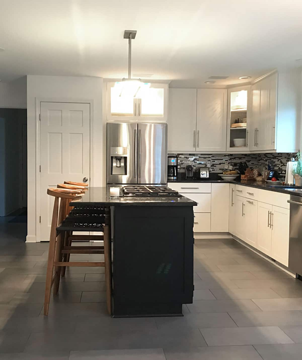
Our existing cabinetry around the perimeter was virtually new from the previous homeowners. They installed a classic white shaker. Now, would I have wanted to switch that out for a mushroom-like color, navy or hunter green? Ya, for sure, but we also didn’t have a million dollars to spend willy nilly. There was nothing wrong with what we had, so The Boy convinced me to keep them. That particular decision srsly cut down on the cost and dust. Remember surface makeover?
Before Kitchen Makeover Photo

RELATED: Don’t believe the hype. White kitchens are not out of style. They just need to be warmed up.
The former homeowners gave the kitchen a good quick flip to sell the house. When we first walked in, we saw the shiny new white cabinetry but totally missed the fact that they had left the island in 1982 and hid its ugliness by painting that sucka black. The glittery granite countertops were pitted and chipped. They had never been replaced. They too, channeled the surface makeover concept. And in case you are wondering, no, white kitchens are not out of style.
When we moved in 3 years ago, the dishwasher leaked…btdubs, so thankful we were smart enough to stick around for the very first wash. But little did we realize replacing that appliance was our first baby step into renovating this space. A few months later, the refrigerator started to leak. Oh, the joys of homeownership.
While looking at the budget, we realized by working with what we had and not replacing every appliance just because and keeping the main cabinets, this kitchen reno wasn’t going to be a budget buster. It truly was a surface makeover…a glamourous surface makeover.
RELATED: The kitchen island was feature on My Domaine and the full kitchen renovation was featured on House Beautiful.
Original Wet Bar Before The Makeover

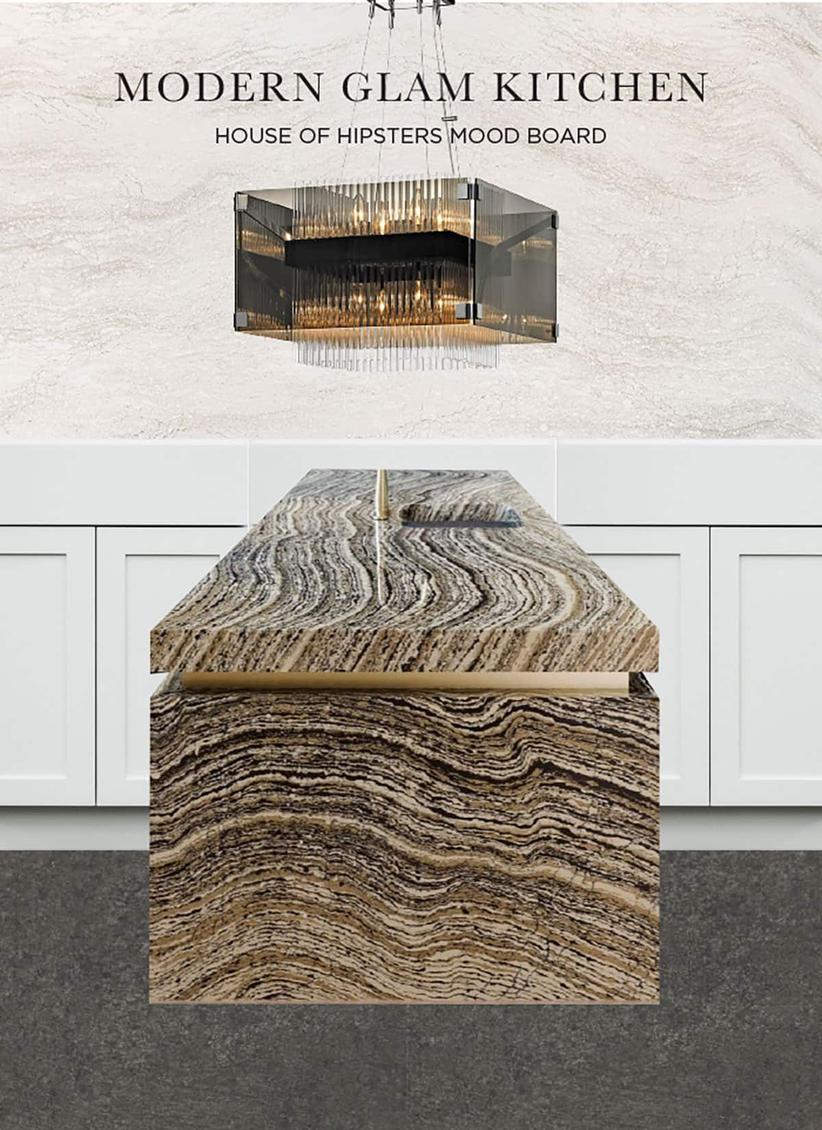
So now that you know the background, let’s dig into the design a bit. Thinking back to the visit to Cambria, the group I was with walked down onto the production floor and laid eyes on a new beautiful quartz design that eventually became Brittanica Warm. For me, it was love at first sight. I knew it had to play a part in the makeover, and it will be the feature of the wet bar.

The floating shelf is going to be interesting to figure out. I’m working closely with my contractor Brian Koch and the fabricator MGT Stone…these are my design ninjas. I don’t want to see any brackets, yet it can’t be too heavy. I knew it was possible, though, because I found this floating shelf inspiration.
RELATED: My bloggery friend Sarah just published a kitchen cabinetry hardware placement guide with examples that I’ll be bookmarking for future reference.
Designing A Bold Kitchen Island
Speaking of how the heck are we going to make that happen, let’s talk about that waterfall island with the brass inlay. Ya, none of us are quite sure how to create it, but we are determined to figure it out…whatever it takes. I’ll hire rocket scientists and nuclear engineers if I have to. It started with kitchen island inspiration on Cambria’s site. They used bold tiger-striped quartz called Clairidge. Soooooo not what I thought I’d be drawn to, but I loved the statement it makes. In an excited tizzy, at the foot of the stairs, I yelled for The Boy. His first response was, “ya, it’s awesome, but our kitchen cabinets are white.” These are black. Hmmmmmm. No sad trombone is going to take this away from me.
Cambria saved the day with their augmented reality app. I downloaded it to my phone, and after a few tries, I nailed the countertop scan.

I dragged The Boy over to my phone, and he knew it too. This bold beauty was going to be the statement piece for the kitchen.
Clairidge as the kitchen island and the perimeter quartz countertops might be too much though, so I went back to the design palette and landed on Ironsbridge. Its light, neutral palette fits perfectly.
To really glam up the look, I remembered visiting Hudson Valley Lighting on the Design Influencers Tour and the Troy Lighting line had some beautiful chandies. I wanted something with subtle movement that could still hold its own next to that kitchen island. It had to be bonkers good. I found Apollo, a smokey bronze and chrome beauty. ERMERGERD!!!!! The heavens opened up. Time to break out the sledgehammers for a kitchen remodel and stay tuned for more updates.

Check Out More of The Kitchen Renovation
Check out the modern kitchen makeover final reveal.
Pairing kitchen pendant lights isn’t always easy. Here are a few that I’ve paired up for you.
Why I chose Cambria quartz for the kitchen renovation and the final stone I chose for the kitchen island.
Kitchen remodel – It’s Demo Day and even though I’m living in chaos, the excitement of a new kitchen has me giddy!
White kitchens are not out of style but if you want a warmer look, here are a few design tips to soften the crisp white.
My favorite kitchen designs that I found on Pinterest.
