Last Updated on December 4, 2024
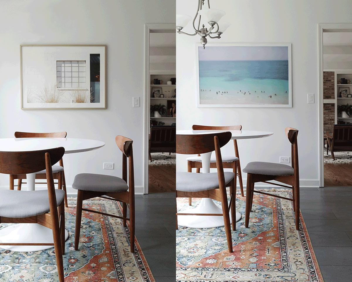
Since we moved in, I’ve kinda wanted to break up with the artwork in the kitchen. A beach scene I bought 5 years ago that hung above the mantle in the old house. I loved it when I bought it, but now, well, I think it’s just time for a change. When we moved, I dismissed my old fling and haphazardly placed it in the kitchen…a tropical Hawaiian beach scene. It’s been a good run with this beachy piece, but let’s shake it up and do a switcheroo.

\The other night while perusing the internets, I started scrolling through Minted. The search for new home decor for Spring was on…but…should it be abstract? A landscape? Portrait? Photograph? Illustration? This was our breakfast table, so maybe an inspirational quote to start the day off right. Or should I create a gallery wall with a balanced mix of all of the above? Decisions, decisions. Spring has this weird alive but not quite yet feeling in Chicago. Patches of brown alongside green grass. Buds on trees without leaves. I wanted this new artwork for Spring to have that same look and feel.
The way I like to shop online is “favorite” everything I’m drawn to and narrow it down later. In the first search result, this piece by Emily Jeffords popped up. It’s so calm and serene. I feel at peace when I stare at it. Although this artwork is gorgeous and full of Spring colors, I felt the bright blues and greens wouldn’t quite work in the space because I live in a home sans bold hues. I do love it though, but too summery. Let’s keep searching. Hmmm…here’s what else I found.

1 /// 2 /// 3 /// 4 /// 5 /// 6 /// 7 /// 8 /// 9 /// 10 /// 11
After staring at all this beauty, the gallery wall again popped into my noggin. Emerged in my favorites was a very neutral palette that meshed just perfectly. How awesome would all of this look grouped together! Minted’s artwork comes framed in just about every size imaginable, making a gallery wall easy to switch up on the fly. Say I have an inspirational quote or landscape I want to swap out every couple of months for the holiday or season…that’s easy peasy. Plus, narrowing down this purchase proved to be quite difficult. Every piece I had favorited was the bomb dot com in my book.
I decided to sleep on it and return wide-eyed and bushy-tailed. I sat and stared at the blank white kitchen wall trying to picture multiple pieces. There’s a lot going on between the bay window, lighting, tulip table, and busy rug…not to mention the shelfie in the background. I hung the original beach scene back up and gravitated back towards the idea of one big piece to really make a statement. Multiple boyfriends could not be had. My mind was made up, I needed to make a decision on one and only one.

Back to favorites. Slowly but surely I started to narrow pieces down. There was no green or yellow in the rug…out when the pretty pineapple and Francis Gold. After a lot of hemming and hawing, I finally picked my new Spring boyfriend and pressed checkout. Licketty split, this is what arrived at my front door…

Meet Ballroom II. It was love at first sight. Also, are you a sucker for good packaging like I am? The inside of the Minted boxes has printed the signatures of artists. How cool is that??? (Um so cool, I kinda wanted to keep it, that’s how cool, but I took a picture instead.)

Once hung, I was amazed at how dramatically artwork can change the entire mood of the space. If I thought I loved it on screen, I loved it even more in person. The former beach scene really pulled the turquoise out of the rug…to the point it was almost clashing. And here I was thinking it was the rug not jiving in the space, while all along it was the old boyfriend waiting for me to break up with him.
The wispy grass in Ballroom II might be what sold me on the piece. It’s so playful, soft, and fluffy looking. What do you think of the new artwork for Spring? Would you have chosen something different? Would you have picked a different favorite or something completely different? Inquiring minds want to know!

Discover More Eclectic Modern Home Decorating Ideas
Get my expert interior design tips on how to decorate with art.
Find a stunning arched cabinet that is perfect for your living room.
Rounding up the most stylist storage baskets for your living room.
