Guest Bedroom Makeover Before & After
Last Updated on December 5, 2024
Hey you guys! How’s your week going? Did you read my last post about decorating with and neutrals? Well, I figured out a solution to my newfound love of whites and neutrals. I’ve teamed up with Decorist to knock out my guest bedroom makeover. It’s been on my to do list, but I just wasn’t sure exactly how I wanted it to look.
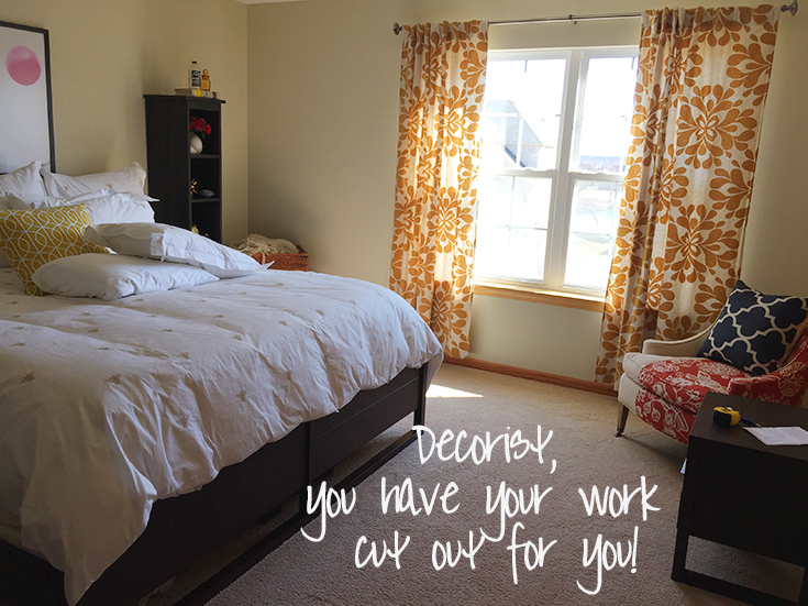
First and foremost, I said I was drawn to Emily Henderson and Amber Interiors design aesthetic…but for you guys, you already know that, and you’re probably eye-rolling me. My favorite retailers were Schoolhouse Electric, West Elm, Lulu & Georgia, and Pure Home. I said I was not trying to spend thousands, but I wanted it to look like I spent thousands. Ha! I’m sure that was hilarious to read. I explained how I didn’t want it to look like it rolled out of a catalog. As far as explaining the room itself, this is verbatim what I wrote, “This is my guest bedroom. I kinda just threw it together when we first moved into our home. Bought things that were on sale just to ‘decorate it’, and it became a home for orphaned furniture. It’s turned into a hot mess that is quite frankly embarrassing.”
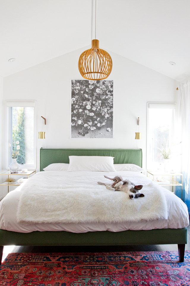
My inspiration…I kinda hinted at it on Tuesday’s post. I had just read Sarah Sherman Samuel’s bedroom progress update and thought it looked so fresh, so clean. Just lovely. I was immediately head over heels for white. And since I had been pinning more neutrals, that seems to be the direction I wanted to take. It also had to be unique and eclectic with hints of mid-century design.
Decorist paired me up with an amazing designer named Ashley, and she asked me a few more questions via email. Yep, you actually get to talk and interact with your designer. This is reminding me, that I need to take measurements of my window and send them to her…darn it! If you’re reading this, SORRY ASHLEY! The Boy has been traveling, and I’m all sorts of discombobulated right now. Anyhoo, about a day or so later, I was given 2 general mood boards, plus a shopping list for each. Once I pick a general direction for the room, Ashley will bust out all the details…rugs, vases, artwork, pillows, paint, etc…and make the room sing!
So, Concept 1 has my existing bed. Concept 2 has my existing bed and nightstands. Ashley advised me to switch out my existing dresser to a vintage dresser to break up the space and make it feel less matchy-matchy. I 100% agree.
For the first concept (more or less using her exact words here), she kept my existing bed and added a two-level brass end table. Her vision is a really light and airy space and thinks the hints of brass will create dimension and add a bit of shine. (Love it Ashley! You’re speakin’ my language!) She wanted it to keep away from the catalog look I referenced. She removed my hideous chair…which she kindly never referred to as hideous, and that is why I love her now. And replaced it with a beautiful woven chair that I’m pretty much obsessing over. It’s seriously too cool for school. Added a small gold caged accent table. Above the dresser, there is a sculptural mirror and replaced the curtains with lighter drapery panels to add interest to the space.
For the second concept, she went for a more natural, earthy feel but still pulled in clean lines and mid-century influence. She again kept my bed, but also kept my existing nightstands. She pulled in more natural materials throughout the design – leathers, jutes, and natural woods. She suggested a bentwood pendant in the corner over one of the nightstands to create visual interest and add height to the space. She also gave me a more traditional mid-century dresser juxtaposed with the circular woven jute mirror. Added in a woven leather slipper chair and Moroccan pouf to give the space texture and layer the space.
Well, I know which one I picked, but I’m not going to tell you. Not yet anyway. I know, I’m horrible and mean, aren’t I? But, I’d love to know, if it was up to you, which one you’d choose, Concept 1 Light & Airy or Concept 2 Natural & Earthy. Leave a quick comment below and check back soon for Step 2 when Ashley will be sending over the complete room with all the fun details. I can’t wait to see the next full board! This is so exciting…and easy you guys. Seriously, I don’t know why I didn’t do this sooner!
I was not paid for this post but did receive a makeover as compensation. I only recommend products or services I use personally and feel my readers will enjoy. All opinions are 100% mine.


